Investing or trading in the stock market can be confusing for beginners. However, with the right tools and understanding, it can become potentially profitable. One of the most useful ways of making an informed investment or trading decision is the analysis of stock charts. It can give you an idea of the present and future performance of a stock.
In this article, we will understand how to read stock market charts and how to use them to make informed investment decisions.
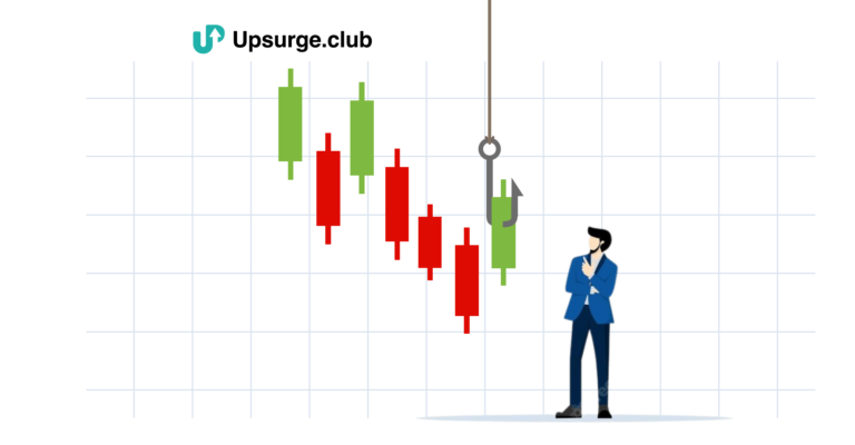
What are Stock Market Charts and How to Read Them?
A stock chart is a visual representation of the performance of a particular stock over a specified period of time. There are several types of stock charts, including line charts, bar charts, candlestick charts, and point-and-figure charts.
Each type of chart displays information in a unique way. It is up to the individual to decide which one they find the most useful and easy to read. Reading these charts can enable you to pick the winning stocks, know when to buy or sell them and learn from the trends in price or market movements.
If you want to learn how to read candlestick charts or other stock market charts, you are in the right place. Just pull up the chart and follow the steps below.
1. Stock Symbol and Exchange
The first step in reading a stock chart is to identify the stock symbol and the exchange it is traded on. The stock symbol (also known as the Ticker) is a unique identifier for the stock, and the exchange is where the stock is traded.
2. Chart Period
Stock charts can be viewed over different time periods, such as 1 day, 1 week, 1 month, 3 months, 6 months, 1 year, and so on. You can choose the time period that you are interested in analyzing. A longer time period can give a better picture of the stock’s overall performance, while a shorter time period can be used to analyze more recent movements for day trading.
3. Price Changes
The main element of a stock chart is the stock’s price movements over the specified period. By hovering your cursor over the chart, you can see the stock’s opening, closing, highest and lowest price for the day.
4. Net Change
The net change is the difference between the stock’s closing price and its opening price for a given period. The net change is usually displayed as a bar on the right side of the chart. A green bar indicates a positive net change (price increase) and a red bar indicates a negative net change (price decrease).
5. Volume
The volume represents the number of shares traded during a given period. The volume indicates the demand for a particular stock in the stock market. If the trades are at a lower point, it means there is not much demand for the stock at the said price point. On the other hand, high trading volume indicates greater participation from traders or investors.
6. Trend Line
A trend line is a straight line that connects two or more price points. It is used to identify a current trend in the market and enables trendline trading. By connecting the highs or lows, an upward or downward trend can be established. A trendline analysis can help you determine if a stock is in a bullish or bearish trend. You can also make predictions about future price movements through trend lines.
7. Support and Resistance Levels
One of the key concepts in technical analysis is support and resistance levels. Support refers to the price level at which demand for the stock is strong enough to prevent the price from falling further. Resistance refers to the price level at which selling is strong enough to prevent the price from rising further. By understanding the support and resistance levels, you can make predictions about potential price changes and make informed investment decisions.
8. Relation Between Price and Volume
The relationship between price and volume is crucial in understanding the stock chart. A high volume of trades, combined with a significant price increase, indicates a bullish trend. Whereas, a high volume of trades, combined with a significant price decrease, indicates a bearish trend. Taking a technical analysis course is the best way for beginners to understand these nuances of stock market charts.
Take the Best Technical Analysis Course!
If you want to learn how to read candlestick charts, line charts, and other charts, why not take it from an expert? A technical analysis course is the best way to get expert knowledge from those who have a wealth of knowledge and practical experience in the field.
At Upsurge.club, we offer the best technical analysis course, which is fully packed with the basics of trading, trendline analysis, moving averages and retracements, and other technical analysis tools. We have an entire category that is a cost-efficient bundle of knowledge that you can benefit from.
You can decide to learn trendline trading and other tools by jumping from one web resource to another but taking a course will definitely fast-track the process while giving you a solid foundation.
Conclusion
Stock charts are a valuable tool for analyzing the performance of a stock. By understanding the different elements of a stock chart, such as price changes, volume, trend lines, and support and resistance levels, investors can make informed decisions and potentially maximize their returns.
Remember, it takes time and practice to become proficient in interpreting stock charts, but with patience, persistence, and a little help, you can do it. At Upsurge.club, get access to the best technical analysis course to help you become a smart stock market investor or trader today!